Astro からヘッドレスCMSとしてWordPressを使う(2)
 kenp
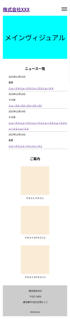
kenp前回作成したサイトをレスポンシブ対応していきます。
ニュース一覧部分
---
import type {News} from "@/interfaces";
import { getDate, getUrl } from "@/newsList";

interface Props {
    news: News;
}

const {news} = Astro.props;
---

<li class="item">
	<span class="date">{getDate(news.date)}</span>
	<span class="category">{news.category_name}</span>
	<span class="newsTitle"><a href={getUrl(news.id)}>{news.title}</a></span>
</li>

<style>

	li {
		line-height: 2.5em;
		border-bottom: 1px dashed;
		display: flex;
		flex-direction: row;

		@media (max-width: 900px) {
			flex-direction: column;
		}
	}
	li span:not(:last-child) {
		margin-right: 20px;
	}
	.category {
	    width: 3em;
	    display: inline-block;
	}
</style>
横並びを縦に並び替えています。
カード部分
---
---
<div class="cardList">
<dl>
    <dt></dt>
    <dd>テキストテキスト</dd>
</dl>
<dl>
    <dt></dt>
    <dd>テキスト2テキスト2</dd>
</dl>
<dl>
    <dt></dt>
    <dd>テキスト3テキスト3</dd>
</dl>
</div>

<style>
    .cardList {
        display: flex;
        justify-content: space-around;

		@media (max-width: 900px) {
			flex-direction: column;
		}
    }
    dl dt {
        width: 200px;
        height: 200px;
        background-color: antiquewhite;

		@media (max-width: 900px) {
			margin: 0 auto;;
		}
    }
    dl dd {
        text-align: center;
        margin: 10px;
    }
</style>
横並びを縦に並び替え、画像部分をセンタリングしています。
ヘッダーナビゲーション部分
---
---
<header>
<h1>
<a href="/">株式会社XXX</a>
</h1>
<div class="menu-wrapper">
<input type="checkbox" id="menu-toggle" hidden>
<label class="menu-icon" for="menu-toggle">
<span></span>
<span></span>
<span></span>
</label>
<div class="overlay"></div>
<nav class="menu">
<ul>
<li><a href="/about/">企業概要</a></li>
<li><a href="/news/">ニュース一覧</a></li>
</ul>
</nav>
</div>
</header>
<style>
header {
display: flex;
justify-content: space-between;
align-items: center;
}
nav ul {
list-style: none;
display: flex;
gap: 1em;
}
@media (max-width: 900px) {
.menu-wrapper {
position: relative;
}
.menu-icon {
width: 40px;
height: 30px;
position: fixed;
top: 45px;
right: 20px;
cursor: pointer;
z-index: 3;
display: inline-block;
}
.menu-icon span {
display: block;
height: 4px;
margin: 6px 0;
background: #333;
border-radius: 2px;
transition: 0.4s;
}
/* ハンバーガーがXに変形 */
#menu-toggle:checked + .menu-icon span:nth-child(1) {
transform: translateY(10px) rotate(45deg);
}
#menu-toggle:checked + .menu-icon span:nth-child(2) {
opacity: 0;
}
#menu-toggle:checked + .menu-icon span:nth-child(3) {
transform: translateY(-10px) rotate(-45deg);
}
/* オーバーレイ背景 */
.overlay {
position: fixed;
inset: 0;
background: rgba(0,0,0,0.5);
opacity: 0;
pointer-events: none;
transition: 0.4s;
z-index: 1;
}
#menu-toggle:checked ~ .overlay {
opacity: 1;
pointer-events: auto;
}
/* メニュー本体(右から出す) */
.menu {
position: fixed;
top: 0;
right: -250px; /* ← 初期位置を左へ */
width: 250px;
height: 100%;
background: #fff;
box-shadow: 2px 0 8px rgba(0,0,0,0.2);
transition: left 0.4s ease;
z-index: 2;
}
#menu-toggle:checked ~ .menu {
right: 0; /* ← 開いたときは左0へ */
}
.menu ul {
list-style: none;
padding: 60px 20px;
flex-direction: column;
gap: 0;
}
.menu a {
text-decoration: none;
color: #333;
font-size: 1.2rem;
transition: color 0.3s;
width: 100%;
display: block;
height: 100%;
padding: 1em 0;
border-bottom: 1px solid;
}
.menu a:hover {
color: #007bff;
}
}
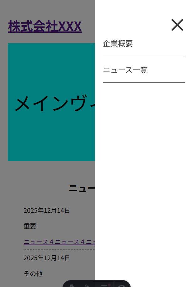
</style>ハンバーガーメニューを追加しています。
JavaScriptを使わず、CSSのみで実装しています。
TOPページ画面
ハンバーガーメニューをクリックした時の画面
\ 最新情報をチェック /